THE SPIRIT OF THE EURO // Competition, Concept Draft (2012)


Contribution: Collaboration in the exhibition concept draft (competition 2012)
AGENCY: Atelier Markgraph with ART + COM
CLIENT: European Central Bank
LEITMOTIF
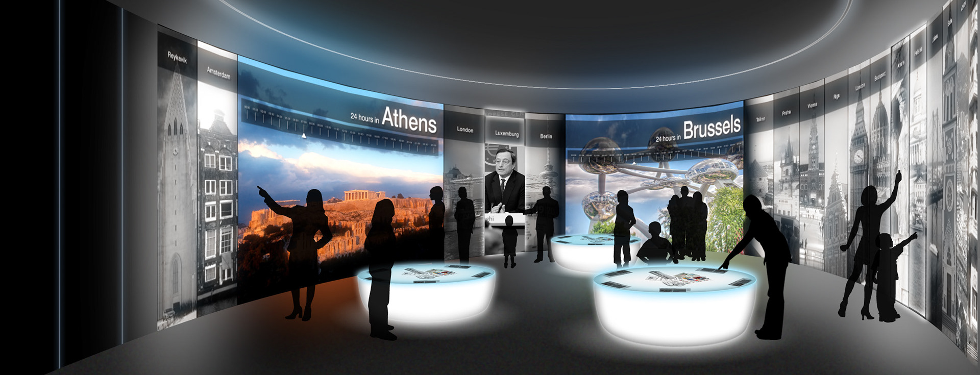
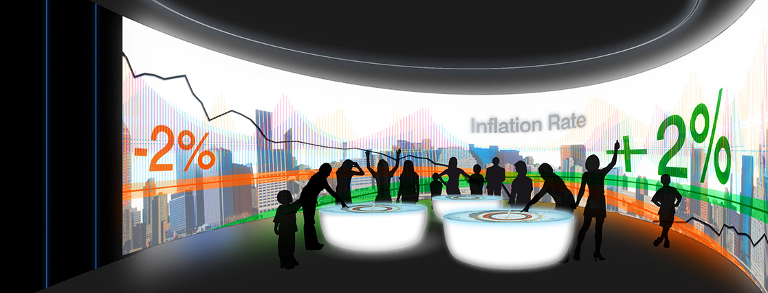
"The whole is greater than the sum of its parts": A fantastical central image unites the different elements of the Visitor Centre. It radiates outwards through the façade. Insights from different directions create a mood of expectancy in the entrance zone. In the architectonic tension between the old and new facades, the free forms of the air space installation and theme islands unfold their effect to the full. The visitors centre is as sophisticated as the tasks and position of the ECB – yet instantly accessible to visitors. In the air, the metaphor of the 'EU integration process' establishes the overarching context. The organically shaped theme islands appear as valuable objects that hint from a distance at the rich content inside.
"The whole is greater than the sum of its parts": A fantastical central image unites the different elements of the Visitor Centre. It radiates outwards through the façade. Insights from different directions create a mood of expectancy in the entrance zone. In the architectonic tension between the old and new facades, the free forms of the air space installation and theme islands unfold their effect to the full. The visitors centre is as sophisticated as the tasks and position of the ECB – yet instantly accessible to visitors. In the air, the metaphor of the 'EU integration process' establishes the overarching context. The organically shaped theme islands appear as valuable objects that hint from a distance at the rich content inside.
AIR SPACE INSTALLATION
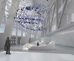
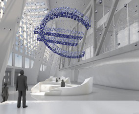
The elements of the Euro symbol spread throughout the whole air space like a dynamic cloud. When viewed from optimal vantage points or 'sweet-spots' – for instance, the Welcome Platform – the logo can be seen and recognized clearly. When viewed from elsewhere, the symbol dissolves into an aesthetically pleasing flow of elements. The installation offers a 'multiple perspective' view of Europe, interpreting our Leitmotif "the whole is greater than the sum of its parts". It is a metaphor for integration: the Euro logo as a connecting / unifying symbolic element in a whole made up of many parts. Visitors are encouraged to move around, adopt different perspectives, and discover Europe.
The elements of the Euro symbol spread throughout the whole air space like a dynamic cloud. When viewed from optimal vantage points or 'sweet-spots' – for instance, the Welcome Platform – the logo can be seen and recognized clearly. When viewed from elsewhere, the symbol dissolves into an aesthetically pleasing flow of elements. The installation offers a 'multiple perspective' view of Europe, interpreting our Leitmotif "the whole is greater than the sum of its parts". It is a metaphor for integration: the Euro logo as a connecting / unifying symbolic element in a whole made up of many parts. Visitors are encouraged to move around, adopt different perspectives, and discover Europe.

